Building Conversation Quests
From a screenshot of curated questions to a themed, dual-format web app—
color theory, CSS custom properties, and an Adobe Express prompt along the way.
This log documents the creation of the Conversation Quests app from a single Instagram screenshot to a full TNT SPARK page. The session covers three design problems that every web developer encounters: choosing a color palette that means something, designing typography that fits the content’s emotional register, and making a single page work for two very different contexts (webpage and social media card).
Watch for Prompt Critique boxes (amber), Design Decision boxes (teal), and Adobe Express Prompt boxes (purple). The most important lesson in this log is not any single technique — it is that design decisions should be defensible: you should be able to explain why you chose every color, every font, every layout.
What you see on the left is what we started with: a plain-text screenshot of an Instagram post. No design. No hierarchy. No color. Just words on white, copied from a phone screen.
What you see on the right is what a single AI conversation produced in one morning:
a classroom-ready motivational poster with a watercolor background painting, frosted-glass card effects,
four-level color coding, Playfair Display typography, a four-colour gradient stripe, and a complete
@media print stylesheet so it can be printed and framed.
No CSS was memorized. No HTML was typed from scratch. The developer described what was wanted; the AI translated those descriptions into working code. That is vibe coding: design-led, AI-assisted, human-directed. The skill is in knowing what to ask for — and recognising when the result is right.
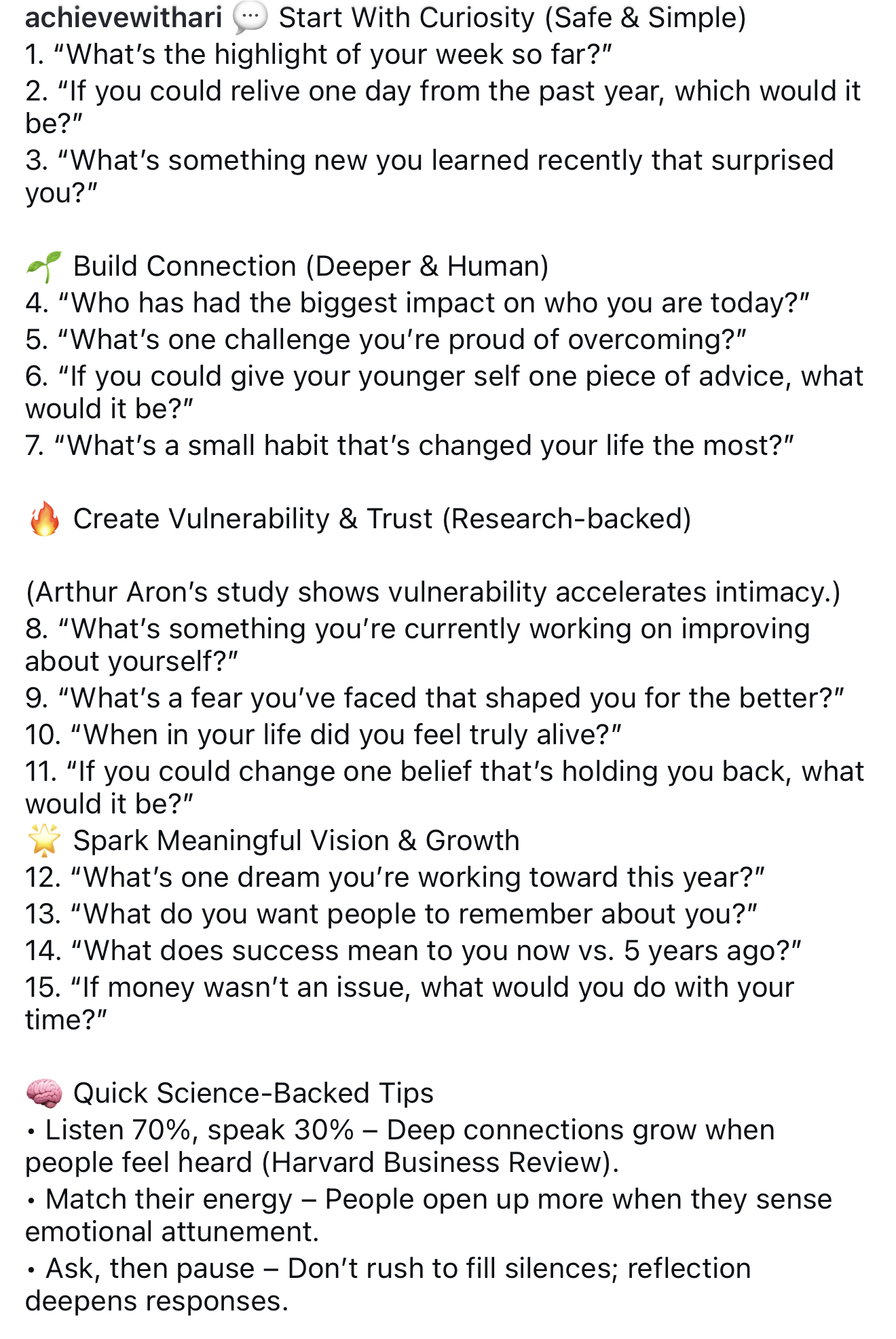
A plain-text Instagram screenshot from achievewithari: 15 questions, no visual hierarchy, no color, no typography system. This is what we handed to AI.
One
Session
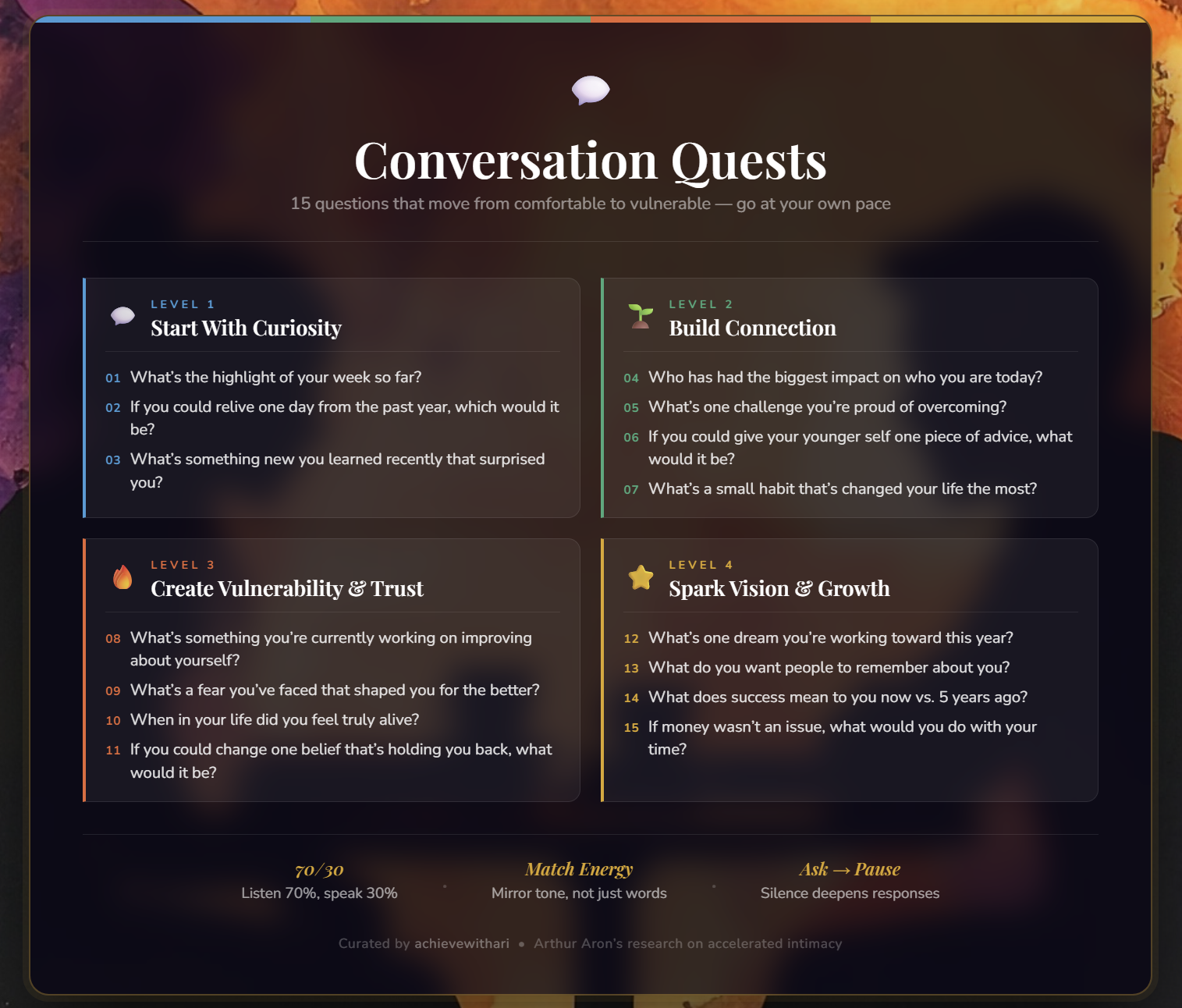
The result: frosted-glass backdrop-filter, CSS custom properties
for four-level color theming, Playfair Display & Nunito typography,
a hard-stop four-colour gradient stripe, and a complete
@media print classroom stylesheet.
Written by AI, directed by a human with a clear vision.
Save the poster screenshot provided in the session as
ConQuestSPARK2026-07-08/images/posterScreenshot.jpg.
The image slot above will display it automatically. Until then,
the background artwork (talkingPic1AExpress.jpg) appears as a preview
of the visual atmosphere — which is itself part of the story.
An expert in relational dynamics and effective communication gave you an image that features a cluster of questions designed to deepen the friendship between two individuals. You want to create a webpage/graphic that showcases that information in a beautiful thematic way where the colors and fonts amplify the material’s content. You want to use HTML/CSS and Bootstrap 5 in the design, and use it as a way to teach those subjects to newcomers in web design. You’ll probably need some ‘background art’ that can house the information, and you’ll need a great prompt to generate that image in Adobe Express. Let’s create convQuest1.html with convQuest1Styles.css. If JavaScript is needed, put it in the HTML document for now. The page should fit well on a webpage or in an Instagram type post. This will be a SPARK application, so we will want a convQuestChatlog.html to showcase the development. For reference I have included another app that ties to TNT.
Count the constraints embedded in this single prompt: (1) colors and fonts that amplify the content — not just look nice; (2) teachable to newcomers; (3) a background image slot with an Adobe Express prompt; (4) dual-format (webpage and Instagram card); (5) SPARK companion chatlog. Each constraint shapes a different layer of the design.
The phrase “colors and fonts amplify the material’s content” is the most demanding constraint. It requires a defensible connection between the visual design and what the questions are about. A random attractive palette won’t satisfy it. The colors need to mean something in relation to safe-to-vulnerable emotional progression.
The phrase “fit well on a webpage or in an Instagram type post” is a dual-format constraint. A page optimized only for desktop will screenshot poorly. A page optimized only for mobile will feel cramped on a monitor. The draw card was designed specifically to resolve this tension: one element, two contexts.
The image (stored as images/conversationQuestions2.png) was an Instagram
post from achievewithari containing 15 questions organized into four tiers:
- 💬 Start With Curiosity (3 questions) — Safe & Simple
- 🌱 Build Connection (4 questions) — Deeper & Human
- 🔥 Create Vulnerability & Trust (4 questions) — Research-backed (Arthur Aron)
- ⭐ Spark Meaningful Vision & Growth (4 questions) — Aspirational
Plus three science-backed conversation tips from Harvard Business Review and Aron et al. The four-tier structure was a gift from the source material: it gave the page its natural organisation and its four-level color system.
The four question levels describe a journey from safe to exposed. The color palette maps that journey by temperature and energy:
- Level 1: Sky Blue (#5B9BD5) — Cool, airy, and non-threatening. Blue is the colour of open sky and clear water — exactly the emotional register of “What’s the highlight of your week?”
- Level 2: Sage Green (#5DA87A) — Natural, growing, grounded. Green suggests organic growth — the right note for questions about habits, challenges, and who shaped you.
- Level 3: Ember Orange (#D96A3E) — Warm, charged, and slightly uncomfortable. Ember is the colour of fire — which is exactly what the 🔥 emoji signals. These questions ask for courage.
- Level 4: Gold (#D4A830) — Radiant, aspirational, earned. Gold is what you arrive at after moving through discomfort. Dreams, legacy, vision — these questions point toward light.
The progression blue → green → orange → gold is simultaneously a temperature progression (cool → warm) and an energy progression (quiet → bright). Students who look at the finished page and find it cohesive are responding to this underlying logic, even if they can’t name it.
Each of the four level colours is defined once in :root as a CSS custom property
(variable). The actual elements — tier headers, question cards, the draw card — use
a second layer of custom properties to read those values:
/* Layer 1: global palette, defined once */
:root {
    --cq-curiosity:  #5B9BD5;
    --cq-connection: #5DA87A;
    --cq-vulnerable: #D96A3E;
    --cq-vision:     #D4A830;
}

/* Layer 2: modifier class sets a component-scoped token */
.draw-card--curiosity { --current-level-color: var(--cq-curiosity); }

/* Layer 3: base component reads the token */
.draw-card { border-top: 6px solid var(--current-level-color); }
This pattern is called CSS component theming. It means the base
.draw-card rule never needs to know which level is active. JavaScript only needs to
swap one class (draw-card--curiosity → draw-card--connection, etc.) to
update every coloured element on the card at once. The CSS handles the rest.
This is the same technique large design systems use to support dark/light mode
with a single class on the <html> element. The principle scales from a four-card
app to a thousand-component design system.
Two fonts were chosen, each for a specific purpose:
Playfair Display (serif, italic) is used for the draw card’s question text and tier titles. Serif fonts carry associations with print, weight, and permanence — the feel of a book or a letter rather than a notification. The italic cut specifically signals a quotation or thought-worth-pausing-on. When a question appears in italic Playfair Display, it reads as something to sit with, not skim.
Nunito (sans-serif, rounded) handles body text and question cards in the tier sections. Its rounded letterforms are friendly and approachable — they counterbalance Playfair Display’s formality and ensure the questions don’t feel intimidating to read. Where Playfair says important, Nunito says come closer.
The pairing works because the two fonts occupy different registers: serif for the spotlight (the drawn question), sans-serif for the catalogue (all questions at once). Students can test this by swapping the fonts: italic Nunito on the draw card feels casual; Playfair Display in the tier cards feels heavy. The right font is the one that fits the context, not just the aesthetic.
TNT’s Boogaloo brand font (defined in tnt-base-styles.css) appears
only in the navbar brand. It was not used anywhere on the content page. This is an intentional boundary.
Boogaloo is playful and energetic — the right voice for the TNT brand identity. But conversation questions about vulnerability and legacy need a quieter voice. Using Boogaloo for the tier titles or question text would create tonal confusion: the typography would be saying “fun!” while the content is asking “When did you feel truly alive?” Brand fonts have appropriate contexts. The skill is knowing when to step them back.
An Instagram post is typically viewed at 1080×1080px (square) or 1080×1350px (portrait 4:5).
On a desktop browser it might be scaled down to around 540px wide. The draw card’s
max-width: 540px targets that real-world rendered width.
The card design was also considered from the perspective of a screenshot:
- A single, clearly readable question — no scrolling required
- The level label above and the source attribution below give the card context without a surrounding page
- The coloured top border immediately communicates depth level at a glance
- Generous padding (2.8rem) prevents the text from feeling cramped in a screenshot
The rest of the page (tier sections, tips) is for the webpage context: exploratory scrolling, reference, and full catalogue. The draw card is for the social context: one question, one moment, one share.
The draw card is the only element on the page with a light background
(#FDF6EC, warm cream). The rest of the page is dark. This is deliberate.
Against the dark page, the cream card creates a spotlight effect — the eye goes directly to it. This mirrors the function of the draw feature: isolating one question from fifteen, pulling it into focus. The visual design enacts the interaction’s intent.
The cream was chosen over pure white because white on a very dark background
creates harsh contrast that reads as a technical artefact (a missed colour choice) rather than
a design choice. The warm undertone (#FDF6EC) says parchment, not screen.
It belongs to the same family as candlelight and paper, which is the emotional register
these questions inhabit.
You mentioned we’d need background art and a great prompt to generate it in Adobe Express. What’s the prompt?
Two silhouetted figures facing each other across a small table, golden-hour light behind them, soft painterly bokeh lights in deep amber, violet, and midnight blue filling the background. Impressionistic watercolor style. Very dark overall, with warm glowing accents near the table. No text. No faces visible. Portrait orientation 4:5. Suitable as a dark hero background for text overlay. Atmospheric, intimate, quiet.
Save the generated image as images/convQuestHero.jpg inside the
ConQuestSPARK2026-07-08/ folder. The CSS in convQuest1Styles.css
already expects it there — no other change needed.
Every phrase in the Adobe Express prompt does specific work. “Two silhouetted figures” creates a human-connection subject without specifying race, age, or gender — the image stays universal. “Facing each other” encodes the app’s thesis: these questions are for two people in conversation, not for solitary reflection.
“Very dark overall” is explicit about the technical requirement: the image must read as a background for white text, not a foreground subject. Without this, AI image generators default to well-lit compositions. The darkness must be requested.
“Suitable as a dark hero background for text overlay” is the most direct phrase in the prompt. It tells the generator the image’s job. When prompting for a background image, always name its function — generators produce very different results for “background for text overlay” vs. “standalone illustration.”
“Portrait orientation 4:5” specifies the aspect ratio so the image doesn’t need to be cropped after generation. Match the prompt’s orientation to the slot’s shape.
The CSS in convQuest1Styles.css is written so the page looks good
without the image:
#hero {
    background:
        linear-gradient(160deg, rgba(20,8,45,0.80) 0%, rgba(8,4,22,0.90) 100%),
        url('../images/convQuestHero.jpg') center / cover no-repeat;
    background-color: #100828; /* solid fallback if image fails */
}
The two-layer background declaration lists the gradient overlay
first (top layer) and the image second (bottom layer). If the image file
is absent, the browser skips the second layer silently and renders the gradient alone
against the fallback background-color. The overlay also darkens any image
enough that white text stays readable regardless of the image’s original brightness.
This pattern — overlay first, image second, solid fallback on
background-color — is the correct way to design hero sections that
can operate with or without an image. It decouples the content from the availability
of the asset.
The animation restart pattern used in drawQuestion():
card.classList.remove("animating"); // Step 1
void card.offsetWidth;              // Step 2 — force reflow
card.className = "draw-card draw-card--" + q.colorClass + " animating"; // Step 3
The problem: if you add the animating class, then remove and immediately
re-add it within the same JavaScript task, the browser batches the style changes and
treats it as “animating was never removed.” The animation does not restart.
The fix is void card.offsetWidth. Reading a layout property
(offsetWidth, offsetHeight, getBoundingClientRect(), etc.)
forces the browser to flush all pending style recalculations before continuing. After the
flush, the browser genuinely sees the class as removed, and adding it back triggers a
fresh animation start.
The void operator discards the return value (we don’t need the width
number — only the side effect of the read). Many developers write
card.offsetWidth; without the void, which works but triggers
a linter warning about an unused expression. The void makes the intent explicit:
I am reading this purely for its side effect.
The draw card’s question text is set via innerHTML, not
textContent:
document.getElementById("drawText").innerHTML =
    "\u201C" + q.text + "\u201D";  // \u201C = " , \u201D = "
Using innerHTML allows the Unicode curly quotation marks
(\u201C and \u201D) to be inserted as real typographic characters,
matching the HTML entities (“ and ”) used in the
static tier cards below. The result is visual consistency between the drawn question and the
catalogue cards.
Is innerHTML safe here? Yes — because the data source is
the hardcoded questions array in the JavaScript file itself, not user input. The
question text cannot contain an injected <script> tag because a developer
wrote every value. The OWASP XSS rule is: never insert untrusted input via innerHTML.
Hardcoded application data is trusted.
If this app ever added a feature allowing users to type their own questions,
the insertion method would need to change to textContent (which renders everything
as literal text, never as HTML). That is when the distinction becomes a security concern.
Let’s create convQuest1.html with convQuest1Styles.css.
The ConQuestSPARK2026-07-08/ folder already had three subdirectories:
images/, scripts/, and styles/ (all empty at start).
That structure answers the “where does the CSS go?” question before it’s asked:
styles/convQuest1Styles.css.
Two stylesheet links in the <head>:
<link rel="stylesheet" href="../styles/tnt-base-styles.css">  <!-- TNT shared -->
<link rel="stylesheet" href="styles/convQuest1Styles.css">    <!-- page-specific -->
The path difference is intentional: ../styles/ (one level up) for the
shared TNT file; styles/ (same folder) for the page file. A newcomer reading
these two paths gets a lesson in relative paths without needing a separate explanation.
A <style> block inside the HTML works. So why a separate file?
- Browser caching. An external CSS file is downloaded once and cached.
Subsequent page loads (and any other page that links the same file) skip the download entirely.
A
<style>block is re-downloaded with every page load. - Separation of concerns. HTML describes structure. CSS describes appearance. Keeping them in separate files means a designer can edit visual styles without touching the HTML, and a developer can edit structure without touching the CSS. Both are less likely to break each other’s work.
- Reusability. The TNT base styles file is a working example of this: one CSS file, every page links it, every page gets the same navbar and footer styles for free.
The tradeoff: an extra HTTP request for the first page load (though modern HTTP/2 makes this negligible). For a small educational site, separation of concerns wins.
- Colour is emotional, not just aesthetic. The four level colours — blue, green, orange, gold — are not arbitrary. Each maps to the emotional register of its questions. When you can explain why you chose a colour, the design becomes defensible. When you can’t, it’s decoration.
- CSS custom properties enable component theming.
Setting
--current-level-coloron a modifier class and reading it in the base class is how professional design systems implement theming. One class swap in JavaScript changes every coloured element on the component at once. - Typography carries emotional register. Playfair Display italic says “pause and consider.” Nunito says “approachable and friendly.” The right font is the one that fits the content’s emotional role, not the one that looks impressive in isolation.
- The draw card design solves two problems simultaneously. A single element — cream card, 540px max-width, coloured border, large italic question — works as a webpage interaction and as a screenshot-ready social media card. Designing for dual context means asking: “What does this look like when the rest of the page disappears?”
- AI image prompts need a function statement. “Suitable as a dark hero background for text overlay” tells the generator the image’s job. Without it, you get a beautiful image that doesn’t work as a background. Match your prompt’s language to the image’s intended use.
I like our design for convQuest1.html. In the original Instagram post, all 15 questions were on one page, as a summary. Let’s take that organization scheme and make convQuestPoster.html in the style of a beautiful motivational poster you might see framed and put in a classroom. I’m thinking it might have a striking background image with the questions grouped by their depth, as was done in the original listing. For consistency, we could use the same color scheme. We can use the same layout for the whole page as we did with convQuest1.html. We’ll need a prompt for the image generator. I could even see just a gorgeous landscape picture, but let’s discuss that if necessary. Of course, we want to add this to our chatlog.
The phrase “I could even see just a gorgeous landscape picture, but let’s discuss that if necessary” is a model of measured prompting. The user offered a concrete visual direction, flagged it as one option among several, and deferred the decision to context. This is the right instinct: describe your intuition before seeing what resources are already available.
In this case, no discussion was necessary — talkingPic1AExpress.jpg
was already in the images/ folder. Looking at the workspace before proposing new
assets is always the right first move. The image not only fit the brief but exceeded it: a
watercolor of two silhouetted figures at a café table, with the four level colours
living in the composition itself (amber-gold centre = vision, violet-blue edges = curiosity).
The prompt also implied a key constraint: same colour scheme. This is the strongest consistency signal in the request. It means the poster and the interactive app should be recognisably the same family despite having very different layouts. One color system, two expressions.
Before proposing a new image prompt, the images/ folder was checked.
talkingPic1AExpress.jpg was already present: a watercolor painting of two
silhouetted figures facing each other across a small café table, warm amber-gold
radiating from behind them, deep violet-blue filling the outer edges.
This image required no new Adobe Express generation. It is also a better poster background than a landscape would have been — for two reasons:
- Subject matter alignment. A landscape is beautiful but generic. Two people facing each other at a table is the literal scenario these questions are for. The poster’s subject and its background are the same image.
- Colour correspondence. The image’s warm centre (amber-gold)
maps to Level 4’s
--cq-vision. The violet-blue outer field maps to Level 1’s--cq-curiosity. The orange transition on one side maps to Level 3. The colour system and the background art say the same thing about the same journey.
The poster design therefore became: full-bleed background image + frosted-glass card centred over it, 2×2 tier grid inside the card, rainbow stripe at the top as the colour legend.
Two options for keeping questions readable over the background image:
- Solid opaque card —
background: rgba(8,5,20,1.0). Fully readable. The image is completely invisible behind the card. - Frosted glass card —
backdrop-filter: blur(12px)+background: rgba(8,5,20,0.82). The image shows through, blurred, as a warm atmospheric texture. Still fully readable because the 82% opacity is high enough.
The frosted glass wins for the poster because the background image was generated specifically for this context. Hiding it entirely behind a solid card would waste its emotional contribution. The blur softens the figurative content just enough that the eye doesn’t race to the figures instead of the questions — but the warmth and colour of the scene remain perceptible as mood.
backdrop-filter is supported in all modern browsers (Chrome 76+,
Safari 9+, Firefox 103+) and degrades gracefully: in environments that don’t support it,
the card’s rgba background renders as a solid dark panel. No fallback code
required — the property is simply ignored.
All 15 questions on one page in a legible size requires a layout choice: (a) single vertical list, (b) four equal columns, or (c) two columns of two tier blocks each.
The 2×2 grid wins because the four tiers already have a natural pairing: the two safe tiers (Curiosity + Connection) sit side by side on the first row; the two bolder tiers (Vulnerability + Vision) sit together on the second. The visual rhythm of the page matches the emotional rhythm of the questions.
Four equal columns would pack the text too tightly for wall-mounting or comfortable reading. A single column would require very small type on a printed A4 sheet. Two columns gives each tier room to breathe.
On mobile, Bootstrap’s col-md-6 collapses to full-width
automatically — each tier stacks vertically. The same HTML, two layouts, zero
JavaScript. This is the Bootstrap grid system doing its core job.
The five-pixel stripe at the top of the poster card is a single CSS
linear-gradient with four hard colour stops:
background: linear-gradient(
    to right,
    var(--cq-curiosity)  0%  25%,   /* no gradual transition */
    var(--cq-connection) 25% 50%,   /* start = end of previous stop */
    var(--cq-vulnerable) 50% 75%,
    var(--cq-vision)     75% 100%
);
Setting each colour’s start position to equal the previous colour’s end position creates a hard edge with no blending. The result is four even solid-colour bands rather than a rainbow blur. This encodes the “four levels” concept in the stripe rather than a continuous spectrum — the distinction is semantically correct and visually sharp.
The stripe also solves the border-image problem: CSS
border-image clips border-radius. A div with negative
margins + overflow: hidden on the parent achieves the same visual effect while
preserving the card’s rounded corners. This is a common workaround worth knowing.
A motivational poster intended for classroom walls should be printable.
The @media print block in convQuestPosterStyles.css handles
the transition from screen to paper:
- Navbar, SPARK bar, hero, and footer are hidden (
display: none). None of these belong on a printed poster. - The dark body background becomes white. The frosted-glass card becomes a plain white rectangle with a light grey border.
- Dark text colours are overridden to near-black for ink contrast.
- The rainbow stripe is preserved (it’s just colours — it prints fine).
- The tier blocks get a light grey fill for visual separation on paper.
The print block is an example of progressive enhancement in reverse: the screen design is rich (dark, blurred, layered); the print version is stripped to what’s essential (text, structure, colour accents). Both serve the same content.
content: attr(data-num) for Question NumbersEach question in the poster uses <li data-num="01">.
The CSS reads it as:
.poster-qs li::before {
    content: attr(data-num);  /* reads the HTML attribute */
    color: var(--tier-color); /* inherits the tier’s level color */
}
This keeps the sequential global numbering (01–15) without JavaScript
and without CSS counters that would reset at each <ul>. The display number
is in the HTML (inspectable, copyable, accessible), styled by CSS, and colours itself from
the tier’s CSS custom property. Three layers, one element.
An alternative would be CSS counter-reset and
counter-increment. Those are powerful for auto-numbering but would restart
at 1 for each tier. To continue from 04 on Tier 2 would require counter-reset:
q-counter 3 on that list — fragile if questions are ever reordered.
The data-num pattern is more explicit and more robust.
The image talkingPic1AExpress.jpg was generated from the
Adobe Express prompt provided in Stage 1 of this chatlog — or from a closely related
version of it. The prompt specified two silhouetted figures, a watercolor painterly style,
intimate atmosphere, and suitability as a background for text overlay.
The result aligned with the app’s four colour levels without any planning: the amber-gold centre glow maps to Level 4 (Vision), the violet-blue outer field maps to Level 1 (Curiosity), the orange transitions to Level 3 (Vulnerability). When a background image and a colour system describe the same emotional journey independently, the design has coherence that goes deeper than matching hex codes.
| File | Status | What it contains |
|---|---|---|
convQuestPoster.html |
New | Full-bleed watercolor background, frosted-glass card, rainbow stripe, 2×2 tier grid (15 questions), horizontal tips bar, attribution, print styles |
styles/convQuestPosterStyles.css |
New | backdrop-filter frosted glass, rainbow stripe pattern, CSS attr(data-num) numbering, print media query, responsive breakpoints |
convQuest1.html |
Updated | SPARK bar: added Poster Edition link alongside the existing chatlog link |
convQuestChatlog.html |
Updated | Stage 2 section added (this content) |
If there’s not one already, please add a link to the poster from the interactive app. Of course, let’s update the chatlog.
The link already exists. When the poster was built in Stage 2, the SPARK bar on
convQuest1.html was updated at the same time. The bar now shows two links
side by side:
<div class="spark-links">
    <a href="convQuestChatlog.html">S.P.A.R.K. Chat Log</a>
    <a href="convQuestPoster.html">Poster Edition</a>
</div>
The poster’s own SPARK bar links back to the interactive app and the chatlog. The three companion pages now form a closed navigation triangle: any page can reach either of the other two.
“If there’s not one already” is one of the most valuable phrases in prompting. It directs the AI to check the current state of the codebase before taking action. Without this phrase, an AI might add a duplicate link or create an inconsistent navigation pattern without noticing the work was already done.
More generally: any request that might touch an existing feature should include a conditional. “Add X if it doesn’t exist” is safer than “Add X.” The former is idempotent — running it twice produces the same result as running it once. The latter can stack up duplicates silently.
Three pages share one identity: the interactive app, the poster, and the chatlog. Each page needs to be reachable from either of the other two. The structure is a navigation triangle:
- convQuest1.html → chatlog, poster (via SPARK bar)
- convQuestPoster.html → chatlog, interactive app (via SPARK bar)
- convQuestChatlog.html → interactive app, poster (via CTA buttons at the bottom)
This pattern means a user who arrives at any one page can find everything else in the family without returning to an external index. The SPARK bar is the right place for these links because it persists across scrolling (it sits just below the sticky navbar) and announces the page’s context: this page is part of a SPARK edition, here are its companions.
The chatlog uses CTA buttons at the bottom rather than the SPARK bar because
the chatlog’s SPARK bar is its own back-bar pattern — a single
directional link matching the ambigMsgChatlog convention. The bottom buttons serve the same
navigation purpose for a page the user reads top to bottom.
I’m quite pleased with this. Let’s follow the same pattern for CSS and Bootstrap 5. Of course, let’s add this discussion to our chatlog too.
“I’m quite pleased with this.” precedes the expansion request. This is a deliberate sequencing pattern: confirm the prototype before scaling it. The HTML essentials page was a working proof of concept; only after seeing it did the user greenlight two more pages with the same structure. This is the right order. Building all three at once before the first was approved would have risked misalignment on the format, voice, and depth.
The phrase “the same pattern” is a precise, low-cost instruction. It means: same card layout, same YOU/AI split, same shared CSS file, same overall page structure. It avoids re-describing 30 design decisions from the first page.
All three Essentials pages link to the same stylesheet:
styles/convPosterCSSEssentials.css. The file was named when the first
page was created; it became the shared stylesheet for the series. Every
.elem-card, .vibe-note, and .elem-code-block
is defined once and consumed by three HTML files.
This is CSS reuse demonstrating itself. The lesson it teaches students who inspect the page source: “One CSS file serves multiple pages. That is not a coincidence — it is the point of external stylesheets.”
The naming is a mild inconsistency: a file called
convPosterCSSEssentials.css also styles a page called
convPosterCSSEssentials.html. The CSS file predates the HTML file by
one session and was named for the HTML Essentials page’s companion stylesheet.
Its shared-use reality overrides the original naming intent — and that is
itself a real-world lesson about how files evolve.
The three-page sequence follows the browser’s own dependency order:
- HTML first — the structural vocabulary. Every CSS rule and Bootstrap class targets an HTML element. Without HTML, there is nothing to style.
- CSS second — the styling vocabulary. Custom CSS rules target HTML elements. Understanding CSS makes Bootstrap demystifiable: Bootstrap is CSS, pre-written.
- Bootstrap last — the framework layer. Once students understand what CSS does, Bootstrap’s utility classes make immediate sense: they’re shortcuts for CSS rules the student has already learned. The Bootstrap page’s observation “Bootstrap is CSS, pre-written” lands differently after the CSS page than it would as a first impression.
The HTML and CSS essentials pages label each code snippet “IN
THE POSTER” because every snippet comes from convQuestPoster.html
or its stylesheets. The Bootstrap 5 page uses “IN THE SERIES” because
Bootstrap is used across all three pages in the family — the modal pattern, for
example, comes from convQuest1.html, not the poster.
When the source file is named explicitly, students can open it and find the exact code in context. “In the Poster” is a navigable reference. “In the Series” says: this code exists somewhere in the project — go find which file. Both are honest. Neither overpromises.
| File | Status | What it contains |
|---|---|---|
convPosterCSSEssentials.html |
New | 10 CSS property cards: color, box model, typography, flexbox, custom properties, background, border, transitions, position, @media queries |
convPosterBS5Essentials.html |
New | 10 Bootstrap 5 concept cards: container, grid, spacing, flex utilities, visibility, navbar, buttons, modal, border utilities, CDN setup |
convPosterHTMLEssentials.html |
Updated | Teaser updated from “Coming Soon” to a live link to CSS essentials |
styles/convPosterCSSEssentials.css |
Shared | Unchanged — already serves all three pages; no new rules required |
convQuestChatlog.html |
Updated | Stage 3 section added (this content) |
Let’s add a card entry to the stylin.html page for the poster we’ve made for the conversation questions, UNLESS you think it’s best to point to the whole series with the interactive app. My idea is that the poster is focusing more on the basics of HTML and CSS and that’s the focus of ‘styln’ apps. Our inclusion of this saga however into the TNT ecosystem, I do want to document in our chatlog. I view that as important.
This prompt contains two embedded questions: (1) which page should the card link to, and (2) should it be documented in the chatlog. The second answer is straightforward (yes — it’s a meaningful milestone). The first deserves genuine consideration, and the user correctly deferred it to the AI rather than deciding in advance.
The phrase “I view that as important” signals that chatlog documentation is not optional. In a long development session, the moment a series moves from a standalone folder into the main site navigation is a decision point worth recording. Future maintainers (and future AI sessions) reading the chatlog will understand when and why this content entered the site.
The recommendation: link to convPosterHTMLEssentials.html (the HTML
Essentials entry point), not the poster or the interactive app. Place it in
Foundations, not Featured Apps.
Three entry points were considered:
- Interactive app (
convQuest1.html) — richest page, but JavaScript-heavy. Stylin is about CSS and Bootstrap; the draw feature is a distraction from the teaching mission. - The poster (
convQuestPoster.html) — visually striking and CSS-rich. But the poster is a content page; it demonstrates CSS without teaching it. - HTML Essentials (
convPosterHTMLEssentials.html) — explicitly teaches HTML, CSS, and Bootstrap 5 using the poster as source code. Every technique in Stylin’s own Foundations section is documented in the Essentials series. This is the right home.
From the HTML Essentials page, students navigate to CSS Essentials, Bootstrap 5 Essentials, and the poster via the SPARK bar — the entire series is one click away without needing a card for each page.
The Stylin page has two sections: Foundations (teaching tools) and Featured Apps (showpieces). The Essentials series belongs in Foundations for the same reason “The Fantastic Four” and “Assemble the Stack” do: it teaches how to build, not just what something looks like when built.
The card title “Vibe Coder Essentials” names the audience explicitly. The subtitle line (① HTML → ② CSS → ③ Bootstrap 5) mirrors the “Assemble the Stack” card’s five-phase progression — a deliberate echo that places this series in the same pedagogical family.
The card’s blue icon (#5B9BD5 = Level 1 Curiosity
blue from the poster) signals its origin without needing a separate label. Students
who recognise the color will know where it came from.
A chatlog entry for this moment serves a different purpose than earlier entries. Earlier entries document design decisions and prompt techniques for students reading the chatlog as a tutorial. This entry documents an ecosystem event: when a series was promoted from a standalone SPARK folder to a named location in the TNT site navigation.
That distinction matters for maintenance. When someone asks “where in TNT is the Essentials series linked from?” the answer is in this chatlog entry. When someone asks “why did it land in Foundations rather than Featured Apps?” the reasoning is here. Chatlogs are not just for students — they are also for the next developer (or the next AI session) who needs to understand the project’s evolution.
The principle: any decision that changes the site’s navigation or content hierarchy is worth documenting explicitly. Folder structure is invisible until it isn’t.
| File | Status | What changed |
|---|---|---|
stylin.html |
Updated | “Vibe Coder Essentials” card added to the Foundations section; links to ConQuestSPARK2026-07-08/convPosterHTMLEssentials.html |
convQuestChatlog.html |
Updated | Stage 4 section added — documents the series entering the TNT site navigation and the reasoning behind the entry-point and section choices |
We also need to put an entry in the explore page for the convQuest1 page in the SPARK area as well as in the styling area. Please document your decision making process as you place those links, in the chatlog.
The prompt names convQuest1.html specifically, but identifies
two categories: S.P.A.R.K. and Styling. This is a signal to expand the interpretation:
the user is thinking of the series, not only the interactive app. The poster belongs
in Styling; the interactive app and chatlog belong in S.P.A.R.K. A literal reading would
miss the intent.
The explicit request to “document your decision making process” acknowledges that category placement is a judgment call. Asking for the reasoning to be documented signals that the user wants to understand the taxonomy, not just accept the result. That is a more sophisticated use of the chatlog than just recording what happened.
Four additions were made to explore.html:
- S.P.A.R.K. offcanvas: Three entries added after the Hot Seat Spinner chatlog — the interactive app, its chatlog, and the poster.
- Styling category card (featured): The poster added as the third featured item (the card had room for one more).
- Styling offcanvas: The poster added, and the Vibe Coder Essentials series added as a second Styling entry.
The SPARK category card itself was not changed — it already had three featured items (the maximum). New apps go to the offcanvas when the card is full.
The S.P.A.R.K. category in Explore documents apps built with the S.P.A.R.K. methodology. The interactive app qualifies because it has a development chatlog that documents every major design decision. The chatlog itself qualifies as a standalone resource — students arriving at the chatlog directly get the full development narrative. The poster qualifies because it was built in the same SPARK session.
The pattern across all SPARK entries in explore.html is consistent: the app
gets a lang-badge lang-js badge; the chatlog gets
lang-badge S.P.A.R.K.. The poster gets lang-badge lang-css because
its primary teaching value is CSS technique, even though it was built with SPARK methodology.
The Styling category card allows up to three featured items. It had two (Purple People Eater and Vibe Codin’). The poster earns the third slot because it demonstrates three distinct advanced CSS techniques that no other featured item in the Styling category covers:
backdrop-filter: blur()— the frosted-glass effect.- CSS custom properties used for component theming across four tier blocks.
@media print— the classroom printing stylesheet.
These three make it a richer CSS showcase than the existing featured items for different reasons. Purple People Eater teaches CSS selectors and specificity. Vibe Codin’ teaches layout and animation. The Conversation Quests Poster teaches modern filter effects, design tokens, and print design. Three different lessons, three different cards.
The Essentials series (HTML, CSS, Bootstrap 5) was added to the Styling
offcanvas as a single entry pointing to convPosterHTMLEssentials.html. This
is the same entry-point decision made for Stylin: the HTML Essentials page is the most
aligned with the Styling category mission (teach how the techniques work, not just use them),
and from there the full series is navigable.
Adding all three individual Essentials pages (HTML, CSS, Bootstrap 5) to the offcanvas would triple the entry footprint without adding proportional value. One entry with a clear label (“HTML → CSS → BS5”) communicates the series structure. Students who click it discover the chain.
After Stage 5, the poster is discoverable from:
- Stylin Featured Apps — reached by students browsing CSS showpieces
- Explore → Styling card — reached by students browsing by category from the main Explore page
- Explore → Styling offcanvas — reached by students opening the full Styling list
- Explore → S.P.A.R.K. offcanvas — reached by students browsing SPARK apps
- Poster’s own SPARK bar — reached from the interactive app or chatlog
Multiple paths to the same page is not redundancy — it is discoverability. Different students arrive from different starting points. A student who opens Explore looking for CSS examples should find it. A student who opens S.P.A.R.K. looking for AI development examples should also find it. The content is the same; the context changes what it teaches.
| Location in explore.html | What was added |
|---|---|
| S.P.A.R.K. offcanvas — 2026 Apps list | Conversation Quests (JS), Conversation Quests Chat Log (S.P.A.R.K.), Conversation Quests Poster (CSS) |
| Styling category card — featured list | Conversation Quests Poster (3rd of 3 featured slots) |
| Styling offcanvas — 2026 Apps list | Conversation Quests Poster (CSS), Vibe Coder Essentials HTML→CSS→BS5 (CSS) |
convQuestChatlog.html |
Stage 5 section added (this content) |
| File | Status | What it contains |
|---|---|---|
convQuest1.html |
New | TNT navbar, hero (image slot), draw card with animation, four tier sections (15 questions), tips section, footer, all JavaScript inline |
styles/convQuest1Styles.css |
New | Page background, SPARK bar, hero art slot, draw card (Instagram-ready), four-tier question layout, tips section, responsive breakpoints |
convQuestChatlog.html |
New | This page |
images/convQuestHero.jpg |
Pending | To be generated via Adobe Express using the prompt above. The page is fully functional without it. |